

Office Interior Branding Singapore: 6 Touchpoints That Work
19 October 2026
Office interior branding works when the brand does a job at each touchpoint (arrival, reception, client route, work floor, wayfinding and pantry) rather than covering every wall in logos. This guide is for brand, marketing and operations leads fitting out or refreshing a Singapore office, and covers the fire, accessibility and landlord rules that branded finishes must pass.
Office interior branding is the use of a company’s identity (colours, typography, materials, messages and values) in its physical workplace, through the reception wall, environmental graphics, wayfinding and the design of client-facing and staff areas, so the office shows visitors and employees who the company is. In 2024, 38.4% of Singapore employers offered scheduled teleworking (MOM). Right-Space’s commercial interior design and build team designs and fabricates these spaces.
What office interior branding does, and what the evidence shows
Office interior branding orients people, signals what the company values and reminds staff why they come in. The research supports its effect on employees and recruits more strongly than its effect on clients, so brief it for those jobs first.
The best recent synthesis is a 2025 review in the Journal of Management by Bukky Oyedeji (London Business School), Yea Hee Ko (Singapore Management University) and Sunkee Lee (Carnegie Mellon University). Of the 167 studies they reviewed, 81% examined spatial configuration and 45% ambience, but only 25% examined aesthetics, the dimension where brand colours, materials and finishes sit. Only 11% looked at external stakeholders such as clients and investors.
Where evidence exists, it points to recruitment. The authors found that firms can “deliberately influence their organizational attractiveness to potential hires” through aesthetic features that signal status and capabilities. Candidates read those signals and they sway job choices.
Hybrid work raises the stakes for the office itself. With 38.4% of employers offering scheduled teleworking in 2024, the days people spend in the office now carry more of the culture. Branding that makes those days feel like the company earns its cost.
Map the brand touchpoints before choosing finishes
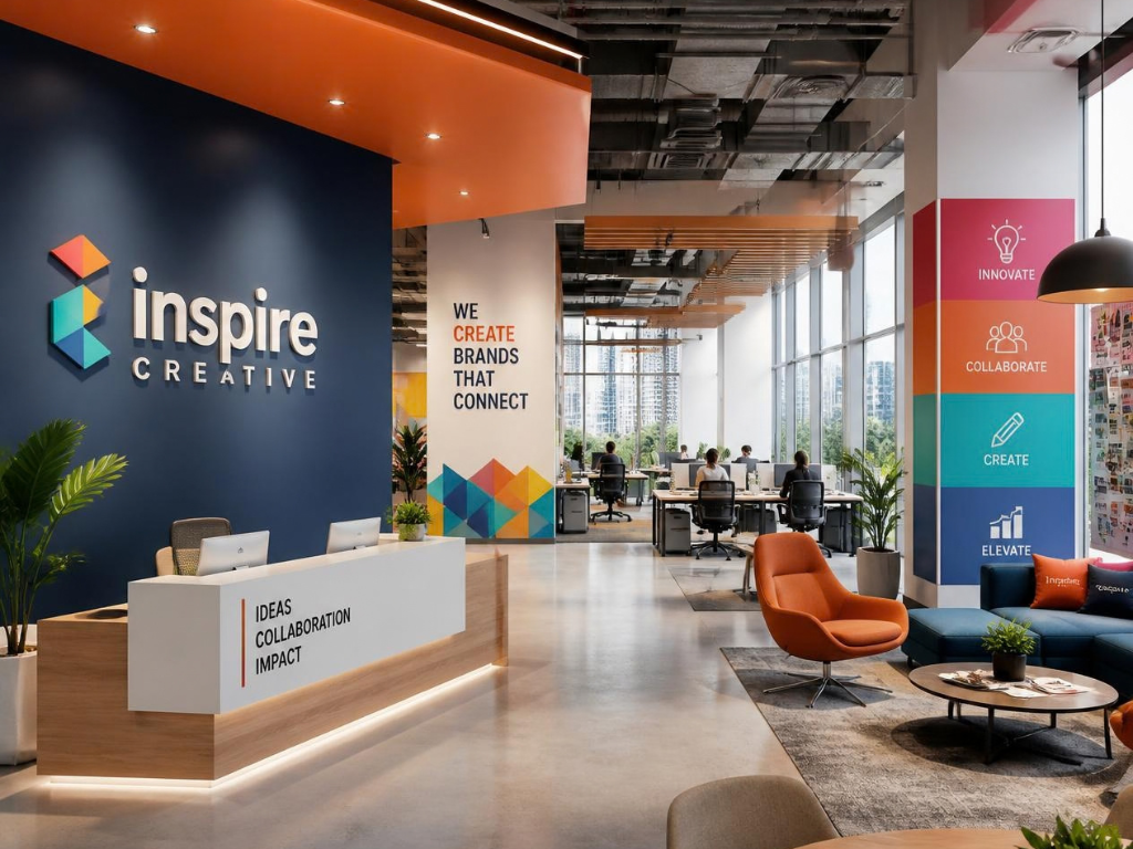
Plan office branding as a sequence of touchpoints, each with a defined audience and job, before anyone picks a colour or a logo size. The map stops the common failure of a heavily branded reception and a generic work floor.
|
Touchpoint |
Who sees it |
Job it does |
Typical elements |
|
Arrival (lift lobby, directory, door) |
Visitors, staff, candidates |
Confirms they are in the right place |
Door signage, directory listing, entrance graphic |
|
Reception |
Visitors, candidates |
States who the company is in one view |
Reception wall, counter, lighting, material |
|
Client route |
Clients, partners |
Carries the brand into meetings |
Meeting room names, corridor graphics, display walls |
|
Work floor |
Staff |
Reminds people of purpose and culture |
Environmental graphics, project walls, colour accents |
|
Wayfinding |
Everyone |
Gets people where they need to go |
Directional and room signs in the brand system |
|
Recharge (pantry, lounge) |
Staff, guests at events |
Shows how the company treats its people |
Material quality, art, informal graphics |
Weight the budget toward the touchpoints people spend time in. Visitors pass through reception briefly. Staff sit on the work floor for most of the week.
Reception wall and client-facing areas
The reception wall should state the brand in one clear view, with one material, one logo treatment and lighting that makes both legible. Visitors decide what the company is like in that view, so it carries more weight than any other single surface.
Common reception treatments include dimensional letters on a stone or timber backdrop, a backlit logo on an acrylic or fabric face, and routed or carved logos in solid timber. Each has a fabrication and fire consequence covered below. Keep the counter low enough for conversation and the logo above it, out of the line of the seated receptionist’s head.
Carry the brand along the client route rather than stopping at reception. Meeting rooms named after something the company cares about (its markets, its products, its history) give visitors a reason to remember them. Display walls that show real work outperform mission statements.
In practice, client areas fail when they look more expensive than the work floor behind them. Staff notice the gap, and so do candidates on interview day.
Right-Space fabricates feature walls, graphics and custom pieces in-house, the same capability it uses for branded builds for L’Oréal and Shu Uemura, which keeps material samples, mock-ups and final pieces under one team.
Brand colours and materials: turning a guideline into a specification
A brand guideline becomes a buildable office only when each colour and finish is translated into named material codes and checked under the office’s actual lighting. Pantone values in a brand book do not specify paint, laminate or vinyl on their own.
Designers convert brand colours into paint systems such as NCS or RAL, laminate and vinyl manufacturer codes, and fabric dyes. The same Pantone reference looks different on a matt painted wall, a gloss acrylic and a woven acoustic panel. Approve physical samples, not screen colours, and view them under the planned lighting before signing off.
Use brand colours as accents and let materials do the heavy lifting. In practice, a full wall in a saturated brand colour dominates every meeting held in front of it, while a brand-coloured stair edge, door or furniture piece wears well. Natural materials, daylight and planting now sit alongside brand colour in most office briefs, as covered in our round-up of office design trends from 2025.
Consistency across sites follows from writing the specification down. For a brand rollout across outlets, Right-Space designed the key visuals once and adapted them to each location, with in-house carpenters building every element so each shop opened on schedule. The same method applies to a company with offices in more than one building.
Environmental graphics and workplace culture
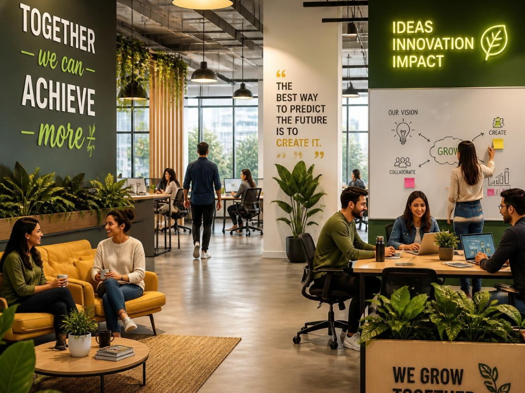
Environmental graphics bring the brand onto the work floor through large-format graphics, murals, wayfinding art and project walls that tell the company’s story. They work when they show real people, work and history, and fail when they repeat slogans.
In practice, slogan walls are the branding element that ages fastest. A values word in 600 mm letters says little after the first week. A wall showing the projects a team delivered, the clients it served or the company’s founding story keeps meaning something.
Plan graphics for change. Tension fabric frames, magnetic panels and printed vinyl let teams update stories without repainting or replacing substrates. Fixed elements such as carved timber or dimensional letters suit the parts of the brand that will not change for the life of the lease.
Place graphics at eye level in the spaces people use as well as in corridors. The behavioural side of how colour, texture and story shape the way people use a space is covered in our guide to the behavioural side of interior branding.
Wayfinding that carries the brand and meets the code
Branded wayfinding must still meet the accessibility rules for signs, which set contrast, finish and symbol size regardless of the brand palette. Where an office fit-out’s addition and alteration works need BCA plan submission, the Code on Accessibility in the Built Environment 2025, in force from 1 November 2025, applies.
Clause 8.4.1 requires all characters and graphical symbols on signage to be glare-free and to contrast in colour and tone with the sign background and the surface it is mounted on. Clause 8.4.2 sets graphical symbols at a minimum of 60 mm on the shorter dimension. Clause 8.3.1 requires directional signs with the Symbol of Access at main lobbies, passageways and changes of direction, guiding people to lifts, entrances and toilets.
Toilets carry an extra rule. Clause 5.1.11 requires tactile and Braille signs at the entrances to male and female toilets in buildings such as offices.
These rules shape brand choices. A tone-on-tone sign in two close brand greys fails the contrast test. A gloss acrylic sign under downlights fails the glare test. Build the brand into the sign system’s typeface, colour pairing and mounting detail, and keep the contrast.
Exit signs are separate. SCDF treats relocating exit signs as fire safety works, so graphics must not cover or move them without a Qualified Person’s submission.
Fire rules for branded walls, ceilings and lobbies
Branded wall and ceiling finishes in Singapore must meet the surface flame-spread classes in SCDF’s Fire Code 2023, Clause 3.13, with Class 0 required in escape routes. Clause 3.15.10 applies those classes to all materials on wall and ceiling surfaces.
The classes run from Class 0 (no flame spread) down to Class 4, tested under BS 476 Parts 6 and 7. Class 1 means flame spreads no more than 165 mm in the test. In a building fitted throughout with automatic sprinklers, the Code places no flame-spread control on rooms and spaces, except in exit staircases, exit passageways, and smoke-free or fire lift lobbies, which remain at Class 0.
That exception matters for branding. A lift lobby on your floor that is designated a smoke-free or fire lift lobby cannot take a timber-slat logo wall or a fabric graphic unless the material meets Class 0. Ask suppliers for BS 476 test certificates for vinyl, fabric, acoustic panels and timber before the design is frozen.
Landlords add their own layer. CapitaLand’s November 2023 fit-out guidelines for one of its commercial buildings require a signage plan in the fit-out submission, landlord approval of blind colours before installation, and a separate form to list the company on the directory board. Brand colours on blinds visible from outside need sign-off.
Cost, timeline and refresh cycle
Office branding costs least when it is designed into the fit-out from the start; Right-Space’s published starting point for commercial interior projects is around S$50,000, with standard projects taking 6 to 12 weeks. Branding elements added after handover cost more because walls, power and lighting have to be reopened.
Split the brand into two layers when budgeting. The permanent layer (reception wall, door signage, wayfinding system, feature materials) is built once for the lease. The refresh layer (environmental graphics, project walls, campaign graphics) is designed to change, so a rebrand or a new campaign replaces prints rather than walls.
Refresh on events rather than a calendar: a rebrand, a merger, a new floor or a lease renewal. Measure what the branding is meant to do. Candidate feedback after interviews, visitor comments and a short staff survey before and after the move give a usable read within six months.
Brand the office for the people who use it
Office interior branding pays off when each touchpoint has a job, the brand guideline is turned into tested material codes, and the fire, accessibility and landlord rules are designed in rather than discovered at inspection. The evidence is strongest for how branded workplaces read to staff and candidates, so the work floor deserves as much care as reception. Built in two layers, permanent and refreshable, the brand keeps up with the company for the full term of the lease.
Fitting out or refreshing an office? Plan your office branding with Right-Space in a free consultation, from touchpoint map to fabricated pieces.
Frequently asked questions
Do office wall graphics need fire-rated materials in Singapore?
Yes, in escape routes and some lobbies. SCDF’s Fire Code 2023, Clause 3.13, sets flame-spread classes for wall and ceiling surfaces. In fully sprinklered buildings, rooms are not controlled, but exit staircases, exit passageways and smoke-free or fire lift lobbies must be Class 0. Ask suppliers for BS 476 test certificates.
Can we use our brand colours on window blinds in a Singapore office tower?
Only with the landlord’s approval. CapitaLand’s November 2023 fit-out guidelines, for example, require tenants to submit blind colours for approval before installation, since blinds sit against the building’s curtain wall. Check your own building’s fit-out manual early, before the brand palette is fixed.
Do office signs have to follow BCA accessibility rules?
Yes, where the fit-out needs BCA plan submission. The Code on Accessibility in the Built Environment 2025 requires glare-free signs with contrasting characters, graphical symbols at least 60 mm across, Symbol of Access directional signs, and tactile and Braille signs at toilet entrances.
How much does office interior branding cost in Singapore?
Right-Space’s published starting point for commercial interior projects is around S$50,000, with standard projects taking 6 to 12 weeks; branding designed into the fit-out sits within that budget. Adding a reception wall or graphics after handover costs more because walls, power and lighting have to be reopened.
Does office branding help with hiring?
The evidence says yes. A 2025 Journal of Management review of 167 studies by Oyedeji, Ko and Lee found that firms use aesthetic features to signal status and capability to potential hires, and that candidates’ job choices respond to those signals. Evidence on clients is thinner.
Related Insights
Browse our latest articles on event management, exhibition design, and brand activation in Singapore.
View All Insights